
Concept · Architecture studio
Buildings that sit quietly in their place
A practice that takes four projects a year. For this client the temptation is to show everything; the correct move is to show almost nothing.
The premise
A small architecture studio whose work is residential, considered, and slow. Prospective clients are choosing on judgement, not on volume.
The problem
Architecture sites default to a full-bleed slideshow of the best three buildings. It looks impressive and says nothing about how the practice thinks — which is the only thing a client is actually assessing when they are about to hand over two years and a large budget.
The approach
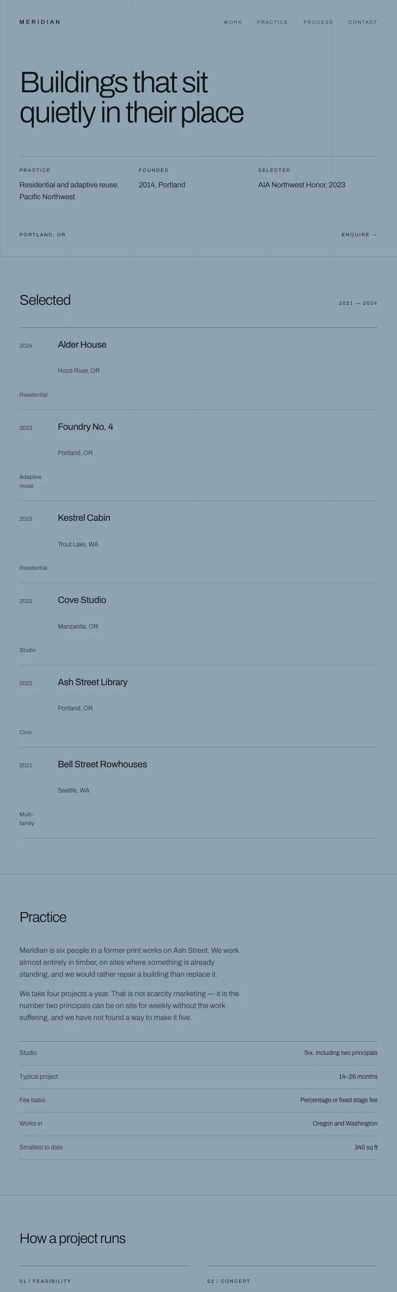
A visible column grid
The layout shows its own structure: consistent columns, visible alignment, generous margins that do not collapse. For this practice the grid is the portfolio — a studio that cannot hold a grid on a web page is not going to hold one in a building.
Four projects, indexed rather than paraded
The work section is a quiet index with dates and locations, not a carousel. If you only do four projects a year, listing them plainly is more convincing than animating them.
One typeface, no decoration
Archivo alone, at four weights. There is no ornament anywhere on the page. The restraint is the message, and any flourish would undercut it.
Slate rather than white
A cool blue-grey ground instead of the gallery white every practice uses. It reads as considered rather than default, and it is where this site's own cream palette originally came from.
What I would want before building it for real
This is the concept the main site borrowed its colour from — #E4E2DC, the cream you are reading this on, is Meridian's card value.
This is a concept, not client work. Meridian is not a real business. The site was designed and built end to end to work through a specific problem, and it is shown here as design thinking rather than as a job I was hired to do.