
Concept · Bakery
Bread worth getting up for
A bakery whose best products are gone by lunchtime. Scarcity is real here, which makes it a design opportunity rather than a marketing trick.
The premise
A neighbourhood bakery with a daily bake list, a Saturday pre-order, and a sideline in classes.
The problem
The frustrating experience for a customer is arriving at eleven to find the sourdough gone. The frustrating experience for the bakery is throwing away what did not sell. Both are the same information problem, and a static 'our products' page solves neither.
The approach
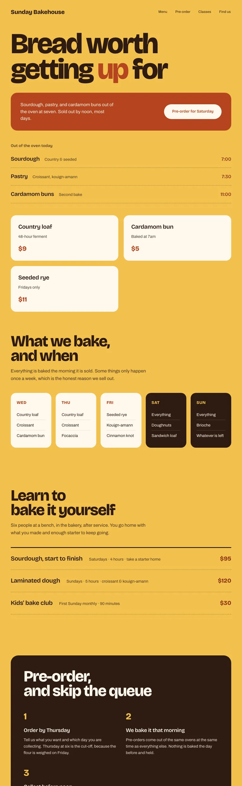
A schedule, not a catalogue
The product section is organised by when things come out of the oven and roughly when they run out. That turns browsing into planning, which is the behaviour the bakery actually wants.
Pre-order as the primary action
One button, repeated at each decision point, doing the same thing. Pre-order is better for the customer and better for waste, so it earns the primary position rather than sharing it with a newsletter signup.
Blocks of colour instead of photographs
Butter yellow and terracotta laid in large flat fields carry the warmth, so the layout does not depend on having twelve excellent food photographs — which a bakery this size will not have and cannot fake.
One typeface, worked hard
Bricolage Grotesque covers display and text. Its variable width lets headlines get genuinely large without a second face, which keeps the page feeling like one voice.
What I would want before building it for real
The yellow is the loudest ground of the six. Every value on it was checked against the darkest textured patch rather than the flat colour, which is a meaningfully different number.
This is a concept, not client work. Sunday Bakehouse is not a real business. The site was designed and built end to end to work through a specific problem, and it is shown here as design thinking rather than as a job I was hired to do.